
Today we’re doing another round of the 5-minute private practice website review. Each month we take a quick look at your submitted websites and I provide my feedback, tips and strategies you can use to make your awesome therapy website even better.
Today’s therapy website is for Dr. Vijayeta Sinh at www.drsinh.com.
Let’s get right to it.
My First Impressions of This Private Practice Website
I love Vijayeta’s homepage.
It’s extremely simple and gets straight to the point without overwhelming the user with a lot of information. I’m taking notes for myself here!
She’s got a bold title that is uber clear and identifies the target demographic of people she helps in her therapy practice.
Then, the only call to action she has is to contact her. The next step she wants her potential clients to take is extremely clear.
Think about your own homepage. Is it clear what you want your clients to do?
Or is it possible you have TOO MUCH information that could potentially confuse your users.
Think of ways you can simplify and get laser focused with your content on your homepage.
Tips For a Robust About Page
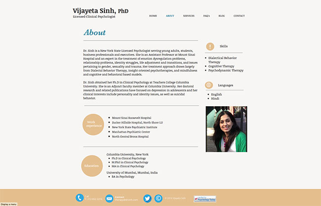
I think Vijayeta can expand on the information on her about page.
I recommend adding a new section that serves as an introduction to her practice and the demographic she serves.
An about page is not just about you, but about your potential clients and giving them more reasons to know, like and trust you enough to come to you with their challenging situation.
So lead with information that speaks to your potential clients before jumping into your full bio.
I think she could move her photo up to the top of the sidebar to help give a visual start to the top of the page. As it is now, my eye tends to jump over her content straight to her photo at the bottom right side.
Related: 5 Resources to Create the Best About Page Ever
Providing the Right Information for Your Potential Clients
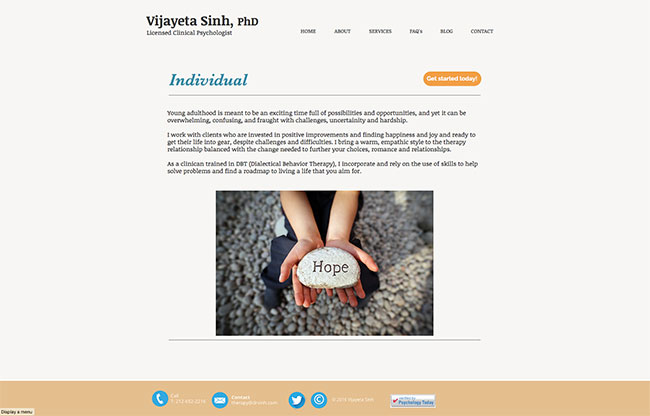
Dr. Sinh has three main pages for her services: Individual, Couples/Families and Groups.
These pages are currently quite simple with general information about each service.
I think it’s helpful to get into your potential client’s mindset in order to provide the right information that they need to take the leap and call you for therapy.
Seeking out a therapist can be difficult for some people. It may be a source of anxiety, especially if someone is feeling shame about reaching out.
You can use your website as a way to comfort people, reassure them that you get what they’re going through and provide the right information to do just that.
For example, Vijayeta mentions DBT (Dialectical Behavior Therapy) on her individual therapy page but maybe she can create a new section and define what DBT is, why she uses it and why it is effective.
She could take these pages a step further by listing some of the specialties she focuses on in her private practice, then create even more specific pages for each of those.
I’d also recommend adding a clear call-to-action under the large photo on each of her services page to make the next step her clients should take very clear.
Conclusion
Dr. Sinh has done an excellent job creating a simple and attractive private practice website.
She’s got all the essential pages on her website, but I think she can spend some time and expand the information within those pages to create more of a connection with potential clients, normalize their challenges and educate them.
The hope is that this information will provide the answer to any objection a client may have about calling to book that first appointment.
Thanks, Vijayeta! Great work!
[av_sidebar widget_area=’Blog Post Cheat Sheet Opt In’ av_uid=’av-2hid8m’]
