
As a designer and consultant, I’ve reviewed many private practice websites. As I look at these websites, I often come across a handful of issues right on the homepage that, if resolved, could help create a better experience for the therapist’s clients.
In this article we’ll explore 5 homepage mistakes I see therapists make when they build their own website.
The Purpose of Your Homepage
As with any page on a therapy website, understanding the purpose and goal of the page will help you create a design and content that is strategic.
We’re not just slapping info on the homepage and hoping for the best, folks!
I often see therapists put a ton of information and too many choices on their homepage, leaving the user to have to sift through the content or just leave due to the overwhelm.
So, what is the purpose of a homepage, anyway?
The main goal of your homepage is to get your potential client to the information they’re looking for as easily and quickly as possible.
Your homepage is a way to get them to the NEXT page, where they can get the information they’re looking for.
Let’s look at 5 mistakes to avoid so you can help your website visitors find what they’re looking for and convert into clients.
Homepage Mistake #1: Not Being Clear Who The Website is For
These days, attention spans are SUPER short.
We are completely overwhelmed by information which causes us to only skim bits and pieces of the information we’re presented with.
Because you only have a few short seconds to grab your potential client’s attention, you have to make it clear on your homepage that they are in the right place.
What would you think if you were looking for help with some of your biggest life challenges, looking at multiple therapists’ websites, and you landed on this homepage?:
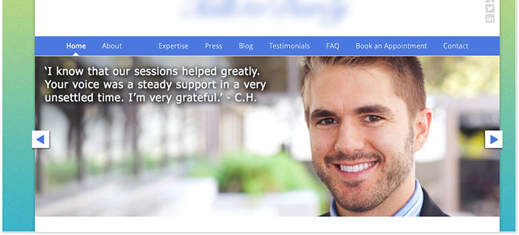
I’m wondering who the guy is in the photo.
It’s probably not the client, but it’s coupled with the testimonial I see.
Maybe it’s the therapist?
Looks like a nice guy…
The point is, I’m not sure… and I’ve wasted valuable seconds trying to figure out if this website is for me and if this therapist can help me.
It’s not quite clear.
Solution:
Let your ideal client know they are in the right place and that you get them.
Meet them where they’re at and think about what they’re feeling as they’re searching for help.
Use the homepage’s prime real estate to quickly communicate who you help and what you help them achieve.
Your “unique selling proposition” as they call it.
For more on developing your “unique selling proposition”, check out this post: 10 Things To Do BEFORE You Create A Counseling Website
Homepage Mistake #2: Sliders That Have No Purpose
We’ve all seen them.
Those huge photo slideshows with overlayed text swishing across the homepage.
But what exactly are they accomplishing?
Too often, I see people giving too much real estate to homepage sliders that don’t actually communicate anything.
Sometimes, a therapist will put a few quotes in this area.
Quotes, while maybe meaningful to you, mean very little to someone who is trying to solve a problem in their life.
It says nothing about how you can help your potential client.
And research shows that users often do not interact with sliders and will often skip right over them.
Check out this quote from Craig Kistler, Founder of Strategy & Design Co. said about homepage carousels/sliders:
“In all the testing I have done, homepage carousels are completely ineffective… In test after test the first thing the visitor did when coming to a page with a large carousel is scroll right past it and start looking for triggers that will move them forward with their task.”
Carousels used to be the bees-knees.
But now they’ve become a distraction when a user is trying to find the info they’re looking for on a website.
Solution:
Basically, don’t use sliders and keep things simple.
Make sure your homepage’s prime real estate is given to a simple, clear message that connects with your ideal client.
Don’t distract your clients with quotes in this valuable homepage area.
Rather, give them the info or opportunity they need to click through to the next page where they’ll find the meat of what they’re looking for on your website.
And if you insist on using a slider, just know that anything after the first slide will most likely be overlooked.
Homepage Mistake #3: Too Much Text & Information
Have you ever been online, maybe searching for a service or a product you want to purchase?
You’re using Google and you click on a promising link, land on the homepage and you’re suddenly met with a wall of text…
It’s like someone’s just handed you a book and told you, “here, read this, you’ll find what you’re looking for in there somewhere”.
It can be frustrating!
This is the same thing that happens to your potential clients when you’ve crammed too much information into your homepage.
They want to know if you can help them.
And they want to know it quickly.
So giving them homework and making them dig for that information won’t help them find what they’re looking for.
Chances are, they’ll get overwhelmed and leave your website.
Remember: The purpose of your homepage is to get the user to the next page; to get them the information they’re looking for.
Once they’ve landed on that NEXT page, they’ve indicated what they’re interested in, so that’s where the bulk of the text/content/info belongs.
When you put it all on your homepage, you’re deciding FOR the client what you think they should know, rather than letting them lead the journey.
And no one likes to be told what to do.
Solution:
Treat the homepage as an introduction to you and your services.
Keep copy simple, clear and let the user decide where they want to go to learn more.
Think about the most important information you can share to gently lead your client into your website to learn about you and your services.
Homepage Mistake #4: Hiding Contact Information
This mistake is a pretty straight forward one with an easy fix.
As a therapist, I’m guessing that the main goal of your website is to get new clients to contact you.
You want to get them off your website and on the phone or in your inbox… and ultimately in your office.
As I mentioned earlier, the busyness of life and the amount of distractions your clients face means you’ve got to make it as easy as possible to use your website and find what they’re looking for.
If they’re looking to contact you, make it as easy as possible, so when they’re ready they know exactly where to click to get in touch with you.
Solution:
Here are a few ways you can make it easy for your potential clients to contact you:
- Have your contact information consistently appear in one place throughout the website (such as a top bar and/or footer)
- Include one clear call to action to encourage the client to take the next step
- Create a single page where clients can contact you and place a link in the menu, making the last link
Do the above and it will help give your potential clients zero excuses about not being able to contact you.
Homepage Mistake #5: Too Many Calls to Action
A call to action is when you ask your website visitor to DO something.
“Click here to learn more”
“Contact me now for a free 15 minute consultation”
Stuff like that.
When your potential clients are faced with too many options, the user can get overwhelmed and decide to leave the website.
They choose ZERO options… the opposite of what you want, right?
Just like mistake #3 above, you’ve given your potential client work in order to find what they’re looking for and take their next step.
Solution:
Think about the primary goal of your website and design your homepage accordingly, leading your client toward that goal.
Maybe your goal is to build up your email list, and that’s where you really connect with potential clients.
Then make the ONE main call to action all about joining your email list.
Is the goal to get them on the phone?
Then your ONE call to action can be focused on getting in touch with you.
It’s ok to have multiple links on your homepage because you do want to lead folks deeper into your website should they want more information.
But have just ONE main call to action that stands out from the rest of the page and encourages the user to take that one step that gets them closer to your goal for your business.
Wrapping it Up
Are you guilty of any of the above homepage mistakes?
Don’t worry!
The great thing about websites is that they are fluid and you can tweak and improve your private practice website over time.
I hope the above mistakes and solutions have helped you re-evaluate your own homepage and inspired you on some changes you can make.
Do you need some professional guidance on your own website? Let’s chat.
If you’re struggling with know what you can do to improve your website’s design or take your online strategy to a new level, I’d love to chat.
I offer 1-hour consultation calls where we can talk about everything and anything related to your website.
We can take a critical look at your design or chat about your content marketing strategy.
We can even get into WordPress technical issues if you like!
Click here to learn more about consultation calls and schedule one today.
