No doubt about it, your homepage is one the first impressions your future clients will have of you and your private practice. With just mere seconds to grab the attention of a website visitor, it’s important to know what to put on your private practice website’s homepage.
In this article I’ll give you 7 crucial elements you need on your therapist website homepage to impress potential clients and capture their attention.
1. Your Logo
Your homepage is the epicenter for your brand and business, so you’ll want to have a legible logo displayed on this page.
It’s often the quickest way to communicate who you are and what your website is about.
Logos are typically displayed in the upper left corner or the top center of websites, but that doesn’t mean you can’t get a little creative if your website theme allows it.
While it can appear smaller on your secondary pages, it’s a good idea to make sure your logo is prominent on the homepage, because this may be the first page many people see when they first come in contact with you and your private practice.
For some tips on how to create a logo for your therapy practice, check out this post here.
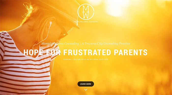
2. A Headline That Captures The Attention of Your Potential Clients
You only have a few seconds to let your website visitors know they’re in the right place.
Create a clear and simple headline that speaks to your potential clients and let’s them know who you serve in your private practice and the outcome you help them achieve.
This is your quick chance to convey the benefits of working with you, so think about your ideal client and what they want to achieve and write your headline from that place.
Here are some examples of great headlines in private practice:
3. Clear Navigation
There’s nothing more frustrating to me than landing on a website and not being able to find the information I’m looking for.
Left to wander around the website, I end up spending more time thinking about the poor user experience than taking in the information on the pages.
One way we can minimize the frustrations of our website visitors and make our information shine is to be really concise and clear with our navigation menus.
Do your best to create a clear structure for your navigation menus, putting only the essential pages in the main navigation, with secondary pages nested underneath.
You can think about it like a well-organized set of folders on your computer. In order to drill down to specific info, it helps to have a few set of top tier folders, with relevant information within those folders.
Do the same for your navigation and keep it organized.
Let your navigation be located in one consistent location throughout your website. It’s ok to have a few links within your content to lead folks to relevant information on your website, but try not go overboard so that it becomes a distraction and people don’t know where to click.
4. A Primary Photo
When laying out or designing your homepage it’s often best to have a primary photo or graphic that draws the user into your therapy website.
What this does is gives your content weight and pulls you down the page.
We typically read left to right, top to bottom, so if you have multiple photos of various sizes and shapes, they will compete with one another and confuse your website viewers because they won’t know where to look.
It’s ok to have multiple photos, but I suggest having one “hero” image that’s larger than the others, conveys what your website and private practice are about and then follow that with other, smaller photos below.
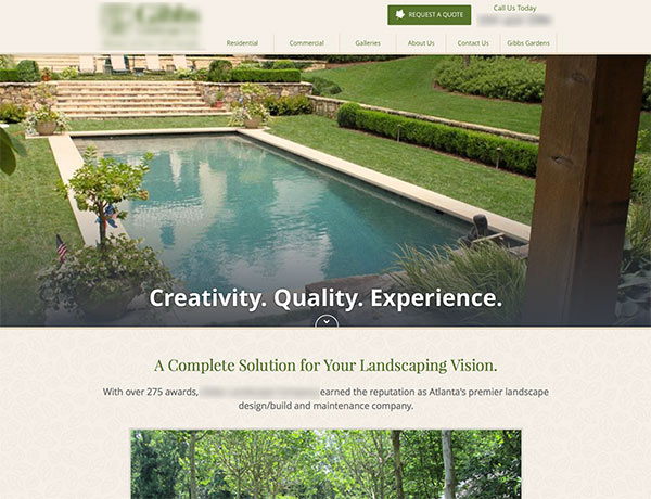
Here’s an example, with names blurred to protect the innocent 😉
We’ve got a landscaping company with a clear, large image that pulls you into the homepage, let’s you know what it’s about and also draws your eye down the page into their information:
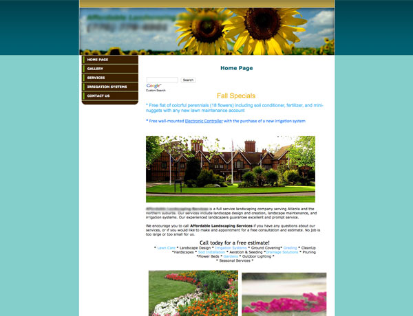
Now, compare that to another landscaping website, where the images are of similar sizes with no clear hero to give the page weight:
Do you see what I mean?
The first example makes me feel like I know exactly where to go and feel calm as I digest the information on the page.
The second example makes me feel overwhelmed because it’s a lot of information and images all at once.
If you can, try and use a website template or theme that has a nice flow to the homepage, with a primary photo that pulls you in and compels you to go further into the information on your private practice homepage and website.
5. The Problems You Help Your Clients Solve
You’ve only got a few precious seconds to connect with your website visitors and let them know that your therapy services can help them with the issues they’re facing.
Think about your potential clients and their state of mind as they’re searching for a therapist they can trust with their problem.
Then write from that place.
As I mentioned above, you can create a headline for your therapist website homepage that explains who you help and what you help them achieve, like an elevator pitch, to quickly let them know if they are in the right place.
Another great copy-writing tactic is to include questions to connect with your visitors and let them know you can relate to the pain or challenge they find themselves in.
Here are a few examples:
- Is pain from your past or worries about the future making it hard to enjoy the present?
- Do you find yourself on the brink of divorce, wondering if there’s any hope at turning your relationship around?
- Do you struggle to find the passion and joy in your life?
So, what do you help your clients achieve? Do your best to make it clear on your therapy website’s homepage.
6. An Introduction About You and Your Practice
After your headline, include an introductory paragraph of a few sentences about yourself, your practice and some of the results one can expect from working with you.
I always like to consider this a lead-in to your more in-depth About Me page that you’ll want to create for your website.
On your homepage, you can keep this brief but use it as a way to, once again, connect with your potential clients.
Follow that with a call to action and you’re in business!
7. A Prominent Call to Action
The final element for a successful therapy website homepage is a clear call to action.
You want to frame the next step that your potential clients should take when they get to the end of your content.
Try to choose just one action you want them to take and make it prominent.
Do you have a free phone consultation you can offer? Or do you want them to simply email you and start a conversation about counseling?
My wife knows that in her private practice, if she can get someone on the phone, she’s about 90% certain she can get that person scheduled for a first-time visit.
So, she offers a free 20 minute phone consultation as her call to action.
Think about what your visitor needs to do in order to become a client after looking at your homepage, then make it simple for them to take the next step.
Conclusion
I hope these seven essential elements help you as you create or tweak your own homepage on your private practice website.
Did I miss anything? Is there something that you have on your own homepage that works well for attracting clients to your therapy practice?
I want to hear about it. Let me know in the comments below!
If you want access to more tips, advanced tutorials, videos and cheat sheets, go ahead and join my VIP list, where you’ll get FREE access to a library of resources to help you create an awesome therapy website and market your practice online.

