
Whether consciously or subconsciously, we make quick decisions about the validity and trustworthiness of a business when looking at their website. The same is true of your private practice.
In this article, I’ll share 5 ways that you could be sabotaging your professionalism and trustworthiness on your own website.
Your website is one of the most important marketing tools you have.
It can be one of the most effective or, unfortunately, ineffective means for establishing yourself as a trustworthy expert, able to help the potential client who is searching for answers and has landed on your site.
So, which one is it for you? Effective, or ineffective?
When you look at your website, do you get a sense of pride, knowing it represents you and the value of your service?
Do you feel like potential clients can quickly get a sense of that value and think, “this is the type of person I want to work with”?
If so, that’s great!
You can walk away proud and go do something fun. You’ve earned it.
If not, read on.
There are a number of subtle ways that you can communicate private practice excellence to your potential clients through your website design.
Let’s get to it.
1: Your Portrait Looks Like it Was Taken On A Phone
You have a beautiful face and your potential clients want to see it.
They long for that connection, and a high-quality, professional-looking photo of yourself can help create that connection.
But when all you have is one photo to work… and it’s blurry and doesn’t fit with the aesthetic of your website… it screams “unprofessional”.
When I see that, I think that the therapist either doesn’t care about the quality of their marketing material, or they just can’t afford to get a decent photo taken.
Remember:
Visitors make split-second judgements about you, your trustworthiness and your credibility when viewing your website.
If your portrait photo is blurry, cropped from an old family photo or looks unprofessional…
YOU will be perceived as UNPROFESSIONAL.
Now, check out one of my past clients, Dr. Lori Buckley…
She had AMAZING photos for me to work with, which made my web designer heart SO happy:
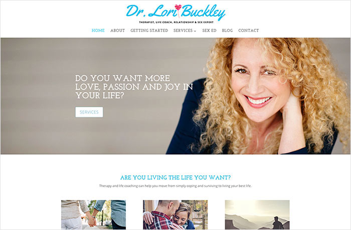
Notice how she’s not just using just one vertical photo.
She had multiple wide shots with blurred backgrounds of her in a coffee shop and other locations.
This not only gave me a so many more possibilities for the website design, but it also created this inviting and warm connection because her face easily distinguishable.
It’s like she’s inviting the viewer into her world.
So, if your personal photos on your website feel a bit unprofessional and aren’t working to create that connection, think about investing in some new ones.
And you don’t have to break the bank on these either.
Here’s a few suggestions for how to get your portraits taken:
- Find a local photographer (Google, Facebook recommendation)
- Search for someone on Craigslist
- Living Social or Groupon have tons of photography deals
- DIY with a real camera
You don’t need to hire the best photographer out there. You can even just do it yourself.
The point is to have high-quality photos to use in multiple ways on your website and other marketing materials.
2: Your Website Doesn’t Work On Mobile Devices
In today’s world, your website has to… HAS TO… work well on mobile devices.
Not only will Google be less likely to suggest your website in search results if it’s not responsive, but you’ll also just annoy your visitors who are looking at your website on a phone or tablet.
If someone can’t use your website easily, they can’t find the information they need to do business with you.
And if they can’t do business with you, why do you have a website at all?
If you can navigate your website easily on a computer, but when you open it on a phone, everything is tiny and your images fall apart, you’re going to turn some visitors away.
Google says 61% of users are unlikely to return to a mobile site they had trouble accessing and 40% visit a competitor’s site instead. (Source)
You are a professional and you need a professional-looking website.
And a professional-looking website is one that works for all users, no matter what device they are on.
So, if it’s been years since you’ve built your website and it doesn’t work well on mobile devices, it’s time to do some work.
Not doing so could mean turning away a whole lot of clients.
3: Your Website Design Looks Like It’s From the 90’s
I was 15 years old in 1997.
And I was also a pretty geeky kid, figuring out all the many ways I could use the family computer to do cool stuff.
I remember waiting for hours just to get through on AOL so I could “surf the web” and chat with my buddies.
The internet was new in those days and OMG how far we’ve come.
Here’s what MSN’s homepage looked like in those early days:
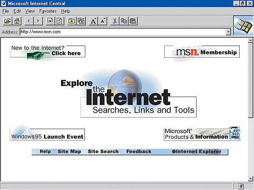
I remember these types of websites.
Buttons floating in odd places.
Blinking images and colors.
Animated text sometimes scrolling across the page.
Fonts in all shapes and sizes.
It worked at the time because we had no idea what we were doing and every business on this new-fangled internet was trying to figure out.
But we’ve learned a lot when it comes to using a website to market a business.
Modern website design is about getting the user to the information they want/need as easily as possible.
So, in a way, websites today look simpler.
Navigation is clear as well as what the website is.
At least that’s how it should be.
Your website doesn’t have to look like a 90’s website, but if it feels outdated, you likely are already aware of it.
It’s time to bring it up to date.
4: You Don’t Have a Logo
Did you know that our brains process images 60,000 times faster than we process words? (source)
Your logo is one of the quickest ways you can communicate with your website visitors who you are and what your practice is like.
It’s also one the first things that your potential clients will look for when landing on your website… even if it’s subconsciously.
We are creatures of habit, so we’re used to seeing that logo at the top of websites that we visit.
When it’s not there, something just feels off.
I often see therapy websites that don’t have this important piece of their brand in place.
There will either be just text, spelling out their name, or no logo at all.
It feels like something is missing or maybe their practice is still being formed and they are still getting all the pieces in place.
I’m left with more questions, wondering why the person doesn’t have a logo, when I should be subconsciously trusting this person and their well established brand (and private practice).
And you don’t need anything fancy or expensive.
Just a simple graphic representing you and/or your practice will establish your professionalism and help your potential clients focus more on your website content instead of wondering if they should trust you.
Need a logo? Check out this post:
Logos for Therapists: The Ultimate Guide to Designing a Logo for Your Private Practice
5: Your Website Is Just Too Busy
Usability is everything when it comes to having a website that connects with your potential clients.
If it takes your users too long to find the information they need, they’re going to bounce.
Since 38% of people will stop engaging with a website if the content/layout is unattractive, (Source) it’s extremely important to do what you can to organize and design your content well.
This can start with the main menu for your website.
Is it very cluttered, with too many links, forcing users to have to sift through all the info in order to find what their looking for?
Start there and find ways to simplify your menu. Not every page on your website needs to be in that menu.
You can take some links and move them to the footer so that those who are looking for them can get to them, but they won’t take away from the pages want your ideal client to definitely see.
Take a look at the most important pages on your website.
Do you have a strategic reason for each element on those pages?
Or do you have a picture floating here or there just because you like it?
Donald Miller, author of Building A Story Brand says this:
“You’ve got to have a strategic reason for every element and even word on the page. If you don’t, or if the reason is just “I like it,” then it needs to go. As the artist and author Austin Kleon says, ‘Creativity is subtraction.’ So don’t be afraid to remove entire sections and cut out major elements.”
A professional-looking website is one that allows its visitors the freedom to find what they are looking for as quickly as possible.
But when a website is cluttered with too many distractions, precious seconds are lost as your ideal client tries to make sense of what they’re seeing and why they should care about what you offer.
Keep it simple. Keep it clear.
Is Your Website Helping or Hurting your Private Practice?
Your website may be the most valuable marketing asset you have in your business.
And it should work for you, bringing in new client leads while you’re in session with your current ones.
If you’re unsure about the steps you should take to improve or redesign your website so that it attracts clients, let’s talk.
Get started by filling out the form on this page and we’ll schedule your free 30-minute consultation.
